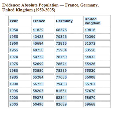
Charts and graphs are fundamental building blocks of historical analysis. As graphical representations of aggregated data, bar graphs, pie charts, and other charts and graphs provide easy ways to visualize sets of numerical data. Some chart formats work better than others, depending on the type of data you need to represent. Take a look, for example, the following data set on population in Europe between 1950 and 2005. Imagine how you might transform the data into a bar graph.
Absolute Population:
France, Germany, and the United Kingdom, 1950-2005